There are many things that todo.space doesn't let you do. Rest assured, it's not because we forgot or missed something, it's by design. When seemingly everyone around is competing by adding more and more features, we are not just not trying to keep up — we even occasionally remove features! How can this be any good? Well, let's not forget that todo.space is a tool. Tools exist to help us do stuff and perform tasks.
When I was a broke-ass student and needed money, I worked at construction and renovation sites where I learned how to do things with my hands and how to use tools — from most basic hand tools to quite advanced power tools. There, I made two interesting observations. The first one was that drilling holes was much more fun than filling them. The second was that the design of even the simplest tools prevented me from injuring myself while using them. Advanced devices and power tools often have numerous elements that exist purely for safety reasons like maintaining the number of fingers on my hands.
While software typically is incapable of severing fingers, it is very much capable of letting users shoot themselves in the foot. Metaphorically speaking, of course. Like real-life mechanical power tools, todo.space also comes equipped with safeguards — to prevent you from spreading yourself thin, and to keep you focused on things that matter. Below are seven essential safeguards we've embedded in todo.space:
Multitasking containment
todo.space safeguards you against having too much on your plate and doesn't allow you to work on more than three things in parallel. Multitasking, in general, hurts productivity and induces stress. Read how to multitask the right way.
Scope of planning containment
todo.space doesn't let you overplan. You can plan up to six tasks upfront, and each additional collaborator in your project adds another three tasks to that number. For example, if you have two collaborators in a project — that would allow you to plan up to twelve tasks upfront.
Designed for focus
You cannot change font size, colour, arrows or even the order of things in todo.space. Playing around with visual aspects is fun and has such a strong intrinsic motivation potential but doesn't add anything to productivity, nor gets things done. Does anyone really believe that moving a task higher in the list will get it completed faster?
Prioritization containment
todo.space doesn't have the Priority field. Crucial tasks are glaring. Unimportant things don't need prioritization either — they need a place to be stored.
Status clarity safeguard copied
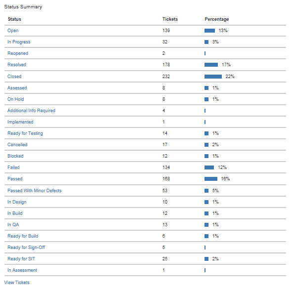
You cannot create custom statuses in todo.space. In reality, things are either done or not done. Custom statuses exist merely to legitimize various not-done states and make them look like it is okay to have them.

Anti-Stress safeguardcopied
Arbitrary Due Dates pollution will never be a part of todo.space. Time pressure provokes anxiety and raises stress levels, which significantly reduces decision quality. Real due dates are rare. Real due dates that can't be amended via communication and customer relationships almost never exist — they typically involve Bruce Willis saving the planet from an asteroid... unless you don't look up. We take the quality and scope of deliverables above dates and timelines, and give you up to two due dates per project to track the real due dates.
Designed for taking pride in your work
You cannot assign tasks to people in todo.space. Manually assigning tasks to people is prone to creating unbalanced workload distribution and bottlenecks. The role of a manager is not to tell people what to do but to communicate goals and objectives. Let the team own the backlog and take pride in their work. todo.space automatically "assigns" tasks to people who start working on them and un-assigns if they were returned to the backlog.
Have you tried todo.space lately? Let us know what you think in our Slack workspace.
If not — try it for free!